So what are my main complaints about Notes 9 and why do i think that IBM should really work on this stuff.
Many important parts of Notes still look like software from the last century.
The first impression a user gets from the Notes Client is the password dialog. The password dialog has not changed since version 6. It looks like a Windows 2000 dialog and looks really foreign on Windows Vista upwards.
The window tdecoration does not use the style from windows and the dropdown boxes and push button are looking like we are running this software on a very old windows version. By the way all screenshots are from my Windows 7 computer.
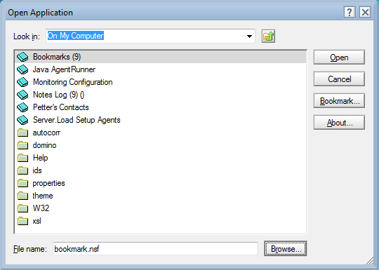
And there are many other places with the same old dialogboxes. And i am not talking from seldom used dialogs. For example look at the "Open Application" dialog.
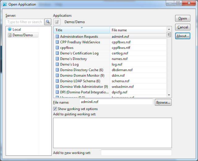
Again the icons are from Notes 6 or older and are complete different to the rest of the icons Notes 9 is using. The window decorators are complete wrong again becaue they are still from Windows 2000 and not fromWindows 7. And the funniest thing is that there is already a new designed "Open Application" dialog and new icons for Applications and folders in the product. This new dialog is used in the Designer client.
This dialog uses the correct window decorators. The widget set is from Windows 7 and the icons have a fresher look than the old icons in designer. Although there is still room for improvement in the designer dialog too, it would be a good replacement for the open dialog in the client.
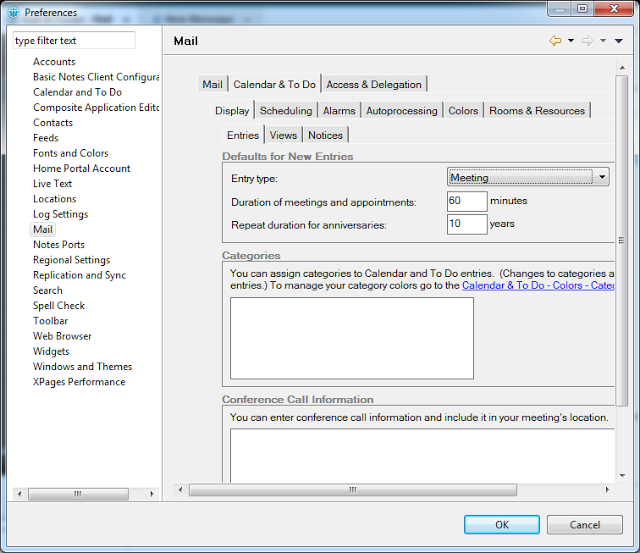
Or lets look at the preferences dialog. Is IBM really thinking that it is a good idea to put an old style notes dialog in an eclipse dialog with scrollbars? I do not think that this is the "exceptional experience" IBM is always promising.
And i can not imagine a reason why the properties dialogs are still not resizable and not redesigned in 2013. Every power user in our company is complaining that it is really ridiculous to use such small and somtimes bad designed dialogs when you want to change a text property or even worse a table property. And again IBM has already proofed that they can do it better with the property sidebars in the productivity editors (Oh if forgot they are discontinued and all my investment in them is gone with them).
So my question is, why has IBM redesigned the already good looking parts like the CA Views and the sidebar if there are still so many very old parts of the product?
The second problem in Notes 9 is that there are so many inconsistencies in the UI.
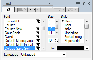
First of all, i do not know an other application which is using at minimum four different widget styles in one application. For example look at the buttons in Notes:
This mix from different widget styles in the same application is a big problem in Notes, because it looks really unprofessional.
And now an easy one to solve. Notes 9 gold uses still different icons for the same thing.
For example follow up flags in Java View, Dialog, Old View and iNotes. Three different icons for the same purpose in four different places.
Or the application and doclinks (Notes client vs. iNotes)
And unfortunatly there are behavior inconsistences all over the whole application.
For example in the new find dialog (by the way, why is this dialog not resizable?) you get help by hovering over the question mark icons and in the mail preferences on the signature tab there is the same question mark icon, but there you have to click the icon to get the tooltip.
Or in the Notes Client you can find the open dialog in "File->Open->IBM Notes Application" and in the designer the same function is under "File->Application->Open". This and many more little differences in behavior make the Notes 9 unpleasant to use.
What is really annoying for customers which use many Eclipse plugins in the notes client is, that the IBM Development team has fogotten to adjust the colour palette in the Eclipse ui framework. So third party plugins look really alien with their blue colours compared to the new grey colour style used in the Notes 9 client.
And this would be really easy to change for IBM. I have written a little patch to some of the Notes Client plugins which changes only a few lines of code and third party plugins will look much nicer in Notes 9.
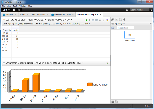
And this is not only a problem in thirdparty plugins . It looks like the same problem is in the Designer Client that some parts of the ui have still the old blue based colour palette.
So the first look is unfortunately a little bit disappointing for me, but i know from the beta that there are many great improvements in the new version. I will show some of this feature in future blog posts.




we tell it since xx years.......
ReplyDeleteA lot of these inconsistencies come from a number of facts, but mainly:
ReplyDelete1) Notes 8 and 9 have the traditional Notes (basic) client underneath the Eclipse layer. Sometimes the old UI pokes out through the new UI. A good example in version 8.x (and may have been fixed) is the calendar preview when deciding whether to accept a meeting invite.
2) Notes dialogs and buttons originate from different places. Some are in the native code of the client, but some are but using forms (such as the e-mail and calendar preferences seen above).
Hello Darren!
ReplyDeleteI am knowing this facts very well, but no one holds IBM back to replace some important old dialogs like the "Open Application" dialog with new eclipse ones. And i think it should be possible to tweak the basic client to use native widgets from the operating system in all old dialogs.
The same seems to have happened with iNotes. Both Todos and Contacts still are using the 8.5.3 forms. That makes the UI to be not uniform or as you say "not professional".
ReplyDeleteHowever, iNotes response time has significantly improved. In iNotes, I guess we can expect this to be solved in next "point" release. Not so sure with IBM Notes I'm afraid.
Keeping in mind the end goal to get exceptional yields gold contributing additionally needs some statistical surveying like other stock and shared reserve speculations. IRA Gold Advisor
ReplyDelete